Background
Causal loop diagramming is a technique derived from the discipline of System Dynamics (SD), which was developed by Jay Forrester at MIT. In the 1990s, SD was popularised by Peter Senge in his two books The Fifth Discipline and The Fifth Discipline Fieldbook.
Causal loop diagrams, also known as CLDs, are a powerful method for identifying the dynamics of causation in organizations, as well as social and engineering systems.
There are a number of important principles in using CLDs:
- They are developed with the client and represent the client’s view of the dynamics of a problem in their organization. The process of developing the CLD may change the client’s views and develop a clearer understanding of the dynamics of the problem and the possible consequences of interventions.
- CLDs are problem-oriented and should capture all the dynamics of a problem within the client’s organisation.
- The CLD must present to both the client and the consultant a plausible and logical “story” or narrative of the problem.
- The CLD, when complete, presents a complete explanation of the dynamics of the system. There should be no exogenous, or unmanageable, variables in the diagram.
- The system’s behaviour varies over time as a result of its internal dynamics
- System components have non-linear behaviour
- The CLD should provide a complete explanation of the behaviour being considered. The general rule here is that most organizations create their own internal dynamics in response to the external environment in response to the external environment. These are often not understood and often problematic, with a good CLD, it is possible for managers to examine and rectify these internal dynamics to solve many of the problems they face.
Tool description/ purpose
CLDs can identify the feedback processes that drive the behaviour of the system.
This is a model of the relationship between the housing and rental markets. At the centre of the model is the expectation of capital gain. This drives both the rental and residential markets. When expectations of capital gains rise the supply of both residential and rental markets also rises. (This is shown by an S at the end of the causal arrow meaning that the two variables move in the same direction. If expectations go up, then supply also goes up. However, it expectations go down in supply also goes down.)
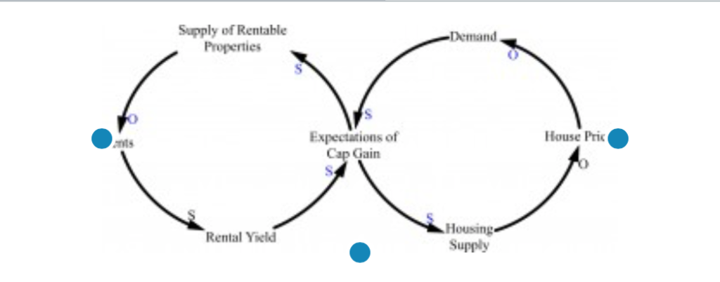
- To understand the dynamics of this model, you can do what is called “walking through the model”.
- Start with Expectations, and moved to Housing Supply. The story goes: if expectations go up then Housing Supply goes up, if Housing Supply goes up, then Housing Prices go down. (Notice there is an O at the end of this arrow. This means the variable goes in the opposite direction).
- You can now work your way around the diagram. When you get to the centre again, work your way around the left-hand side of the diagram
- The concept of Behaviour over Time
- The most important aspect of CLD’s is that they are designed to provide clear explanations of the “behaviour over time” (BOT) of organizational systems. They begin with a description of client issue graphed over the some time period, here the impact of donor restrictions as a result of a decline in donor health, which was attributed to the frequency of blood donations and the base blood count of the donors. The central issue for the client is shown in the BOT graph below.
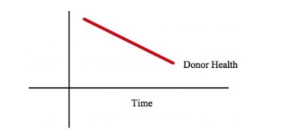
- Once the time-based dynamic of the client’s problem has been established, it is possible to build the causal relationships around that problem.
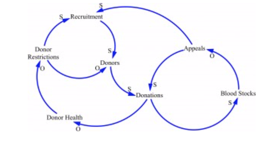
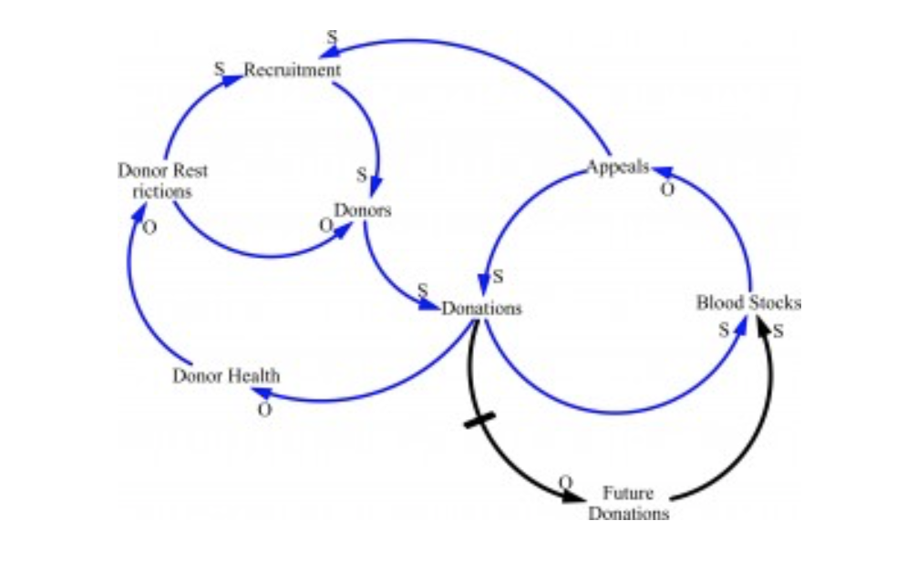
- The development of a CLD explores the relationships that surround the issue. One of the most important elements of the CLD is the identification of feedback loops within the system under consideration. This model is an example of a feedback system where Appeals increase Donations, which in turn increase Blood Stocks leading to a declining need for Appeals. This is an example of a balancing loop that brings the system back into some equilibrium state. The counterintuitive effect of this approach was that the Appeals tended to bring in donors who would normally donate later in the year, effectively “drawing forward” their donations. This meant that when their scheduled donation was due, they had already donated. This shortfall in donors had the potential to lead to another round of appeals. this is an example of reinforcing loop, where the behaviour of the system forces a repetition of that behaviour.
- The application of CLDs in the business context allows us to explore the dynamics of client issues. Often the client will think of a problem as being manifested a certain point of time. CLDs help understand the time based dynamics of the problem. This often produces new and different insights for the client. It also helps identify how some issues may maybe unintended consequences of previous policies.
The Freeways Models
This exercise example is the model of the dynamics of freeway building and begins with an analysis of behaviour over time (BOT)
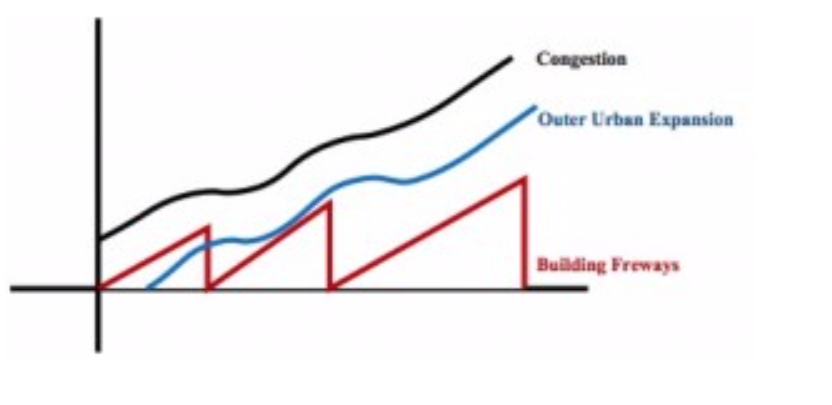
The BOT indicates that building freeways slows the growth of congestion but, because it also simulates outer urban expansion, the problem continues.
You are going to develop a causal diagrams around this particular problem but before you go ahead with this you need to become familiar with the Vensim modelling software.
You can download the software and complete a short tutorial by clicking on this link to the Vensim software tutorial.
Now you’ve completed the software tutorial you are ready go ahead with the traffic congestion model.
The blank models are available on the UTS Online Black board. They are the Traffic, Spaghetti, Freeways and New product Launch models
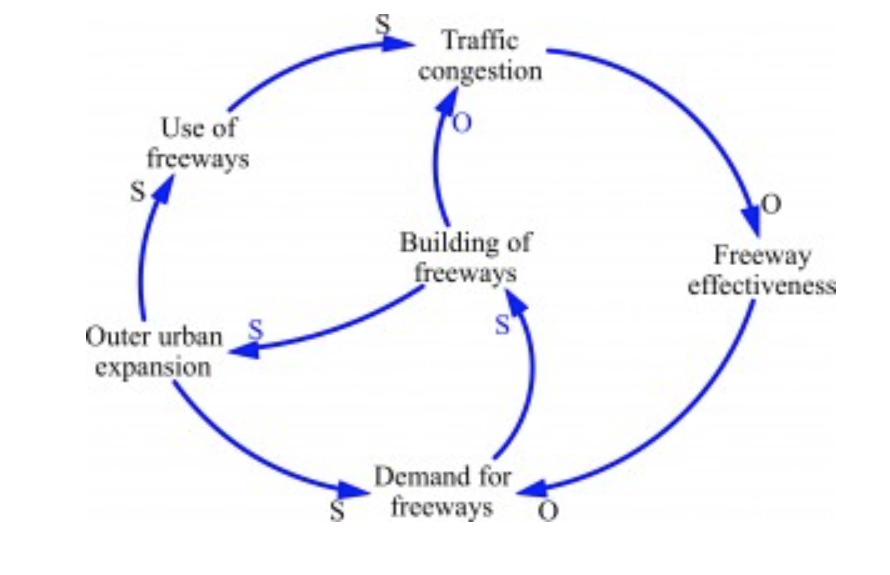
Remember: The arrows indicate causal connections.
Here are some clues to getting started with this model.
Traffic congestion increases the Demand for freeways, Outer urban expansion increases the Use of freeways etc.
The S and O at the end of the arrow indicate the direction of the causality. An S indicates causation is in the Same direction.
If the Demand for freeways goes up, then Building of freeways will also go up. However, if Demand for freeways goes down, then Building of freeways also goes down.
An O indicates causation in the Opposite direction. As Building of freeways goes up, Traffic congestion goes down (or slows) and as Building of freeways goes down, Traffic congestion goes up.
Here is a possible solution
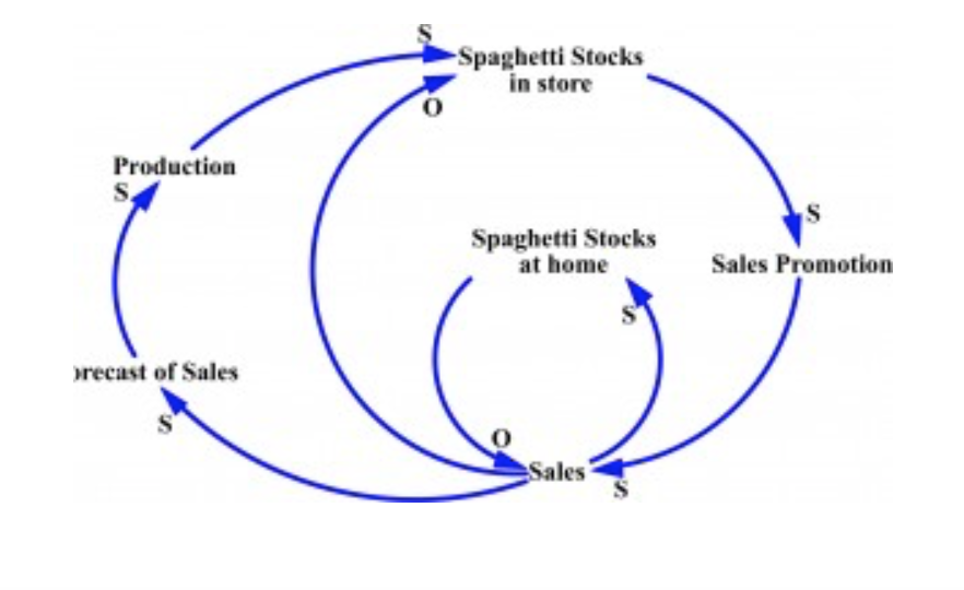
The Spaghetti Inventory Problem
The following example demonstrates these three principles. A spaghetti manufacturer found that their retailers were overstocked with spaghetti. To reduce stock, they had a “buy one, get one free” promotion, which cleared the excess stock. The production department, seeing what they interpreted as an increase in demand, increased production. Their increased production flowed to the retailers at a time when households were still eating their way through the “two for one” offer. The “story” for this loop starts begins with Sales. As Sales increase Spaghetti Stocks at home increase but this has the effect of decreasing future sales and increasing the Spaghetti Stocks in store. This situation is exacerbated by the impact (discounted) Sales have on Forecast of Sales and Production.
Here is a possible solution
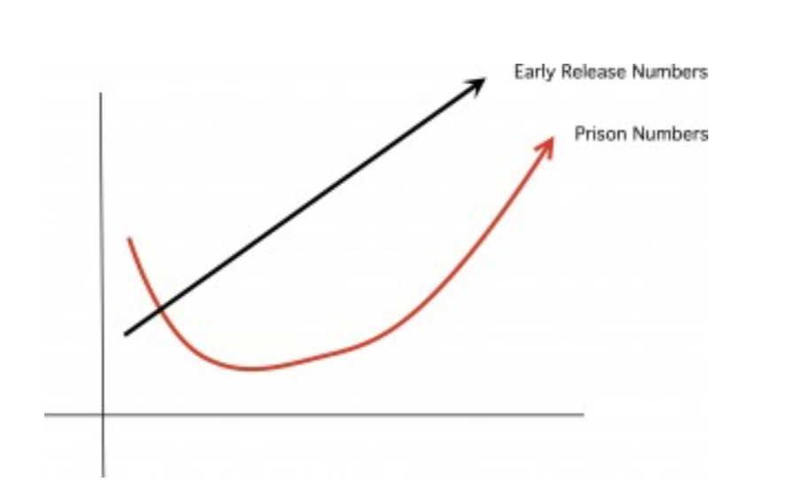
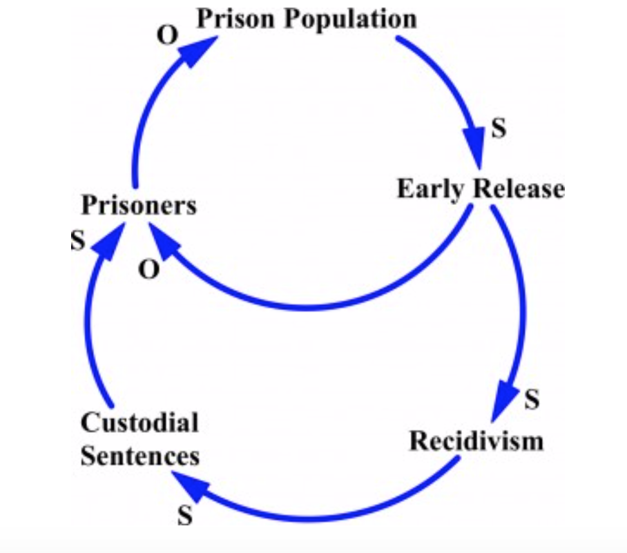
The Prisons Model
The causal diagram below provides another introductory exercise for developing CLD skills. The CLD is designed to show the counterintuitive policy affects of early release of prisoners from jail. Early release programs are designed to reintegrate prisoners into society and to minimise the time they spend in overcrowded jails. The potential risk and counterintuitive effect is that these prisoners will reoffend and come back into jail and further exacerbate the problem of overcrowding.
Here is a possible solution
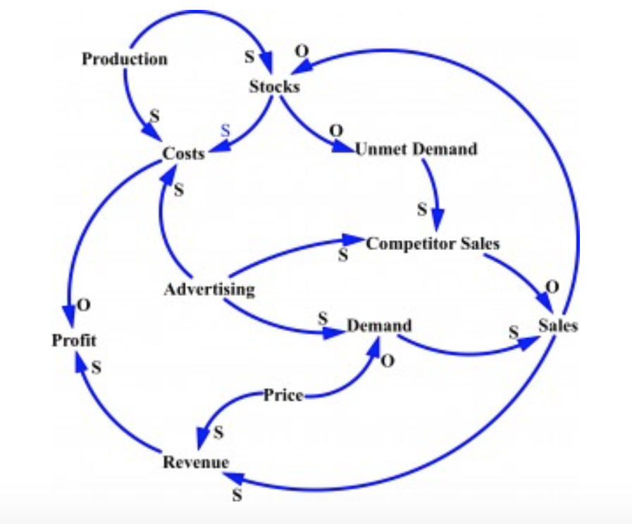
The New Product Launch
The next example is a larger and more complex one. A consumer goods company has an impressive record for new product launches based on the work of a sophisticated and talented marketing department.
The measure of success for product launch had become that the new products would “walk off the shelves” and the “retailers are screaming out for product”. This resulted in production struggling to keep up with demand, frequent retailer stock-outs and lost sales.
However, the company is concerned that, while the initial product launches are very successful, their competitor frequently enters the market with copycat products and is able to capture significant market share.
This is the BOT of New product sales, inventory and competitor sales.

Here is a possible solution
- Get buy-in for the purpose of the diagram
- Diagrams are best built top down
- Use nouns (e.g. production) for variable names and the positive sense of the variable (e.g. encouragement)
- Don’t use the same variable more than once in a diagram
- Don’t include adjectives or descriptors (e.g. more, less)
How to use the tool to build your own CLD
The steps for constructing a Causal Loop Diagram are detailed below:
- Ensure you have a properly defined and agreed purpose for the diagram.
- Start with a key action, condition or client issue.
From here you can take a couple of approaches:
- Take the fundamental factor of the client issue
- Identify what causes it and what it causes and connect them using arrows,
- Develop the model by telling the story the causal connections the grow from this first cause diagram
- Draw the links between the variables they are directly related and label each link as S (same) or O (opposite).
- Look for further links that could complete feedback loops.
- Ensure that as much behaviour is possible is developed endogenously.
OR
- Make an initial list all the potential key variables that affect the key action or condition and decide if they are intrinsic to the business system (e.g. production times) or outside the system (e.g. macroeconomic factors).
- Revise the list, adding necessary variables and deleting unnecessary ones.
- Set out the variables in a coherent structure on one page.
- Draw the links between the variables they are directly related and label each link as S (same) or O (opposite).
- Look for further links that could complete feedback loops.
- Ensure that as much behaviour is possible is developed endogenously.
Note: Once the diagram is completed, you should look for the high-level messages and insights and check that they are sensible, yet novel.